Colour effect
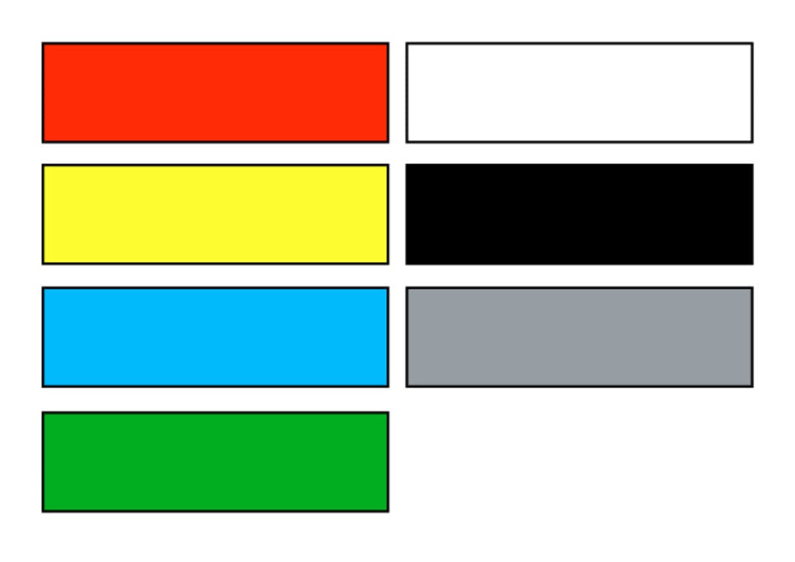
- Red is the colour of fire and the expression for power, warmth and energy. The colour has a dominant effect. Where pale red is concerned, the aspect of warmth decreases while its lightness increases.
- Yellow is the lightest colour in the colour wheel, but used in the foreground it does not have the same energy as red.
- Blue is the colour of the sky and is one of the cold colours which gives an effect of depth. Dark navy blue has a rather melancholy effect, whereas blue-green emanates peace.
- Green is the colour of vitality. Its nuances range from calming to refreshing.
- White is one of the non-colours and is the polar opposite of black. White stands for purity.
- Black stands for darkness and appears sinister and negative.
- Grey is one of the non-colours and appears indifferent.
The effect of colours is explained from the physiological point-of-view of actually seeing colour and the psychological aspects of sensory perception. The lure of colours triggers associations and is interpreted in the context of the social and cultural environment. The different hues belonging to a colour can, in turn, also have other effects. The effect of individual colours can be increased by way of a colour contrast.


Iittala Flagship Store, Amsterdam

Light and Building 2000, Frankfurt

Restaurant Aioli, Vienna

Teattri Ravintola, Helsinki
Colour effects are particularly important for
- exhibitions
- trade-fair stands
- sales areas
- restaurants


