What you should know about colour contrasts for lighting design

The difference between at least two colour tones is called colour contrast. Colour contrast is elementary for visual perception. We can see objects by separating them from their surroundings. For this reason, colour contrast should also be taken into account in lighting design for architecture. The contrast between body colours or light intensities can emphasise areas in (interior) design. On a white background, in addition to coloured light, the light colours of different shades of white – ranging from a reddish warm white and neutral white to a bluish cool white – are a design tool in lighting design.


Seven colour contrasts according to Itten
The seven colour contrasts are based on the colour theory of the Swiss painter and art theorist Johannes Itten. The approach he developed is not based on the physical and chemical properties of colour but on its subjective effect. Psycho-physical perception therefore plays a decisive role here.

Colours themselves
This contrast refers to the effect of pure colours in their highest possible intensity. The primary colours of yellow, red and blue create the greatest contrast. The colour contrast becomes weaker with secondary or tertiary colours or with decreasing saturation.
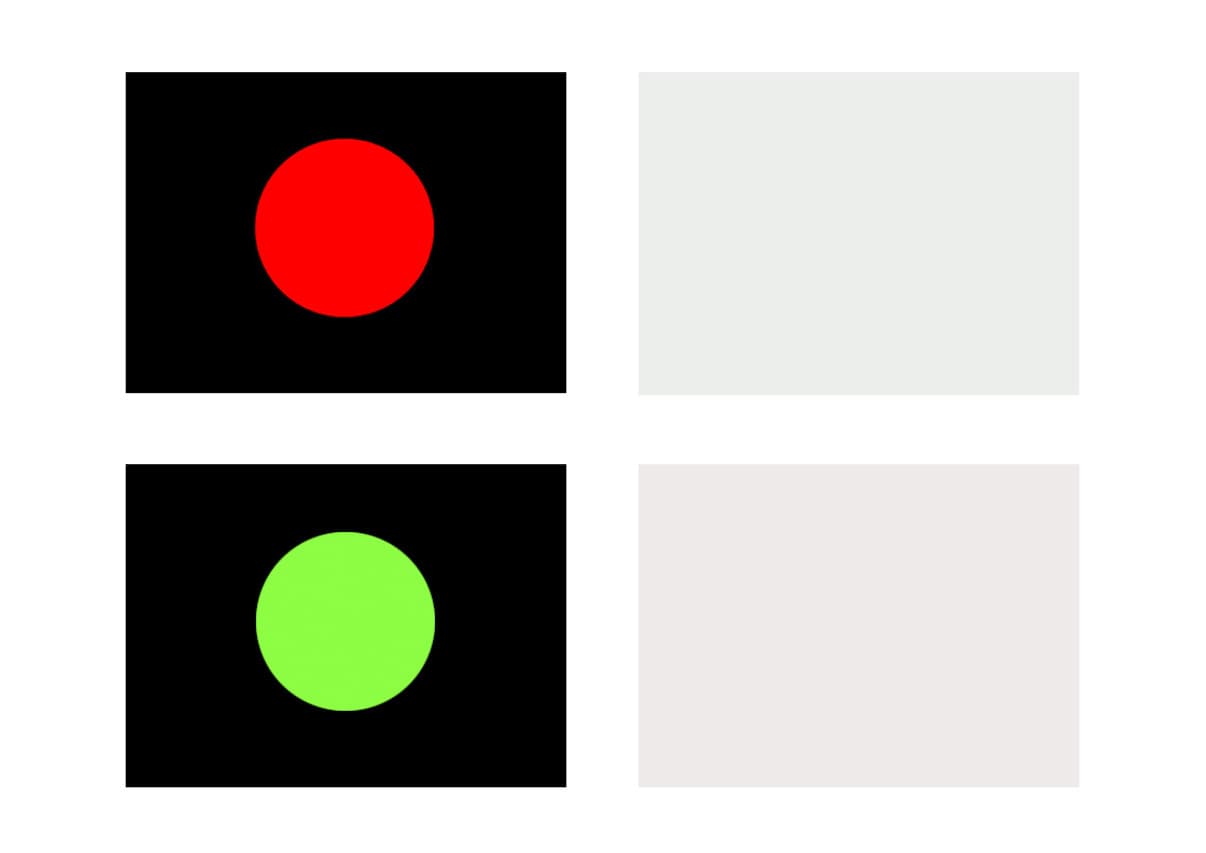
Simultaneous contrast
The effect of simultaneous contrast is caused by the perceptual processing of the eye: after looking at a colour for a long time and then looking at a neutral grey, the eye forms a simultaneous contrast colour. Red leads to a greenish grey shade. This complementary interaction makes a grey surface have a red tinge if it is next to a green surface. Colours thus change their effect through the influence of their adjacent colours.
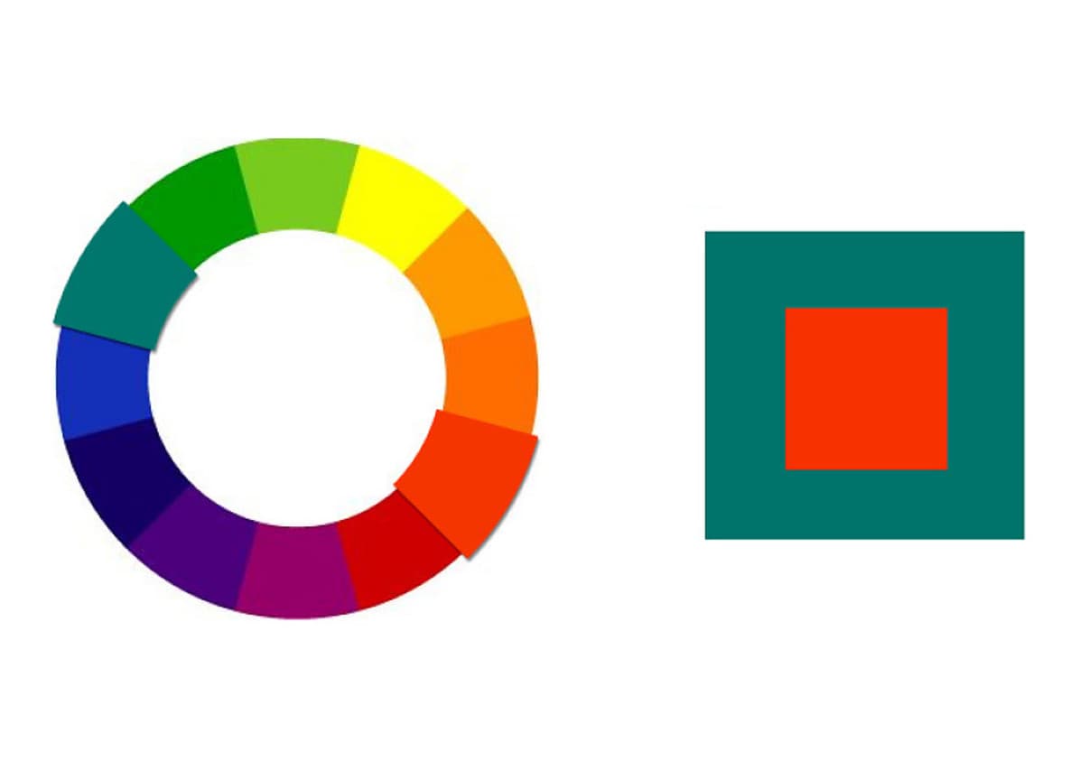
Complementary contrast
The pairs of colours opposite each other in the colour wheel form the complementary contrast: blue and orange, red and green, and yellow and violet. Yellow and violet show the greatest light-dark contrast in the colour wheel, whilst orange and blue show the greatest cool-warm contrast.
Interesting:
The complementary contrast between red and green causes an increase in the brilliance of the colours to the point of achieving a flicker effect. This is why we also speak of a flicker contrast in such cases. The eye reacts to the colours and their radiation intensity at identical brightness.

Quality contrast
The quality contrast or intensity contrast describes the contrast of pure colours to dull colours. The mixing of pure colours with grey tones makes them dull and murky. The quality of the purity is lost. In their effect, pure colours dominate over dull colours.

Quantity contrast
Quantity contrast refers to the size ratio of coloured areas to each other. A large coloured area with a small area of a contrasting colour increases the colour effect of the main area.

Warm-cool contrast
In the colour wheel, the warm colours with red and yellow components are positioned opposite the cool, blue colour tones. Green and magenta make up the neutral transitions. The effect of a predominant colour can be increased when combined with an accent from the opposite colour.
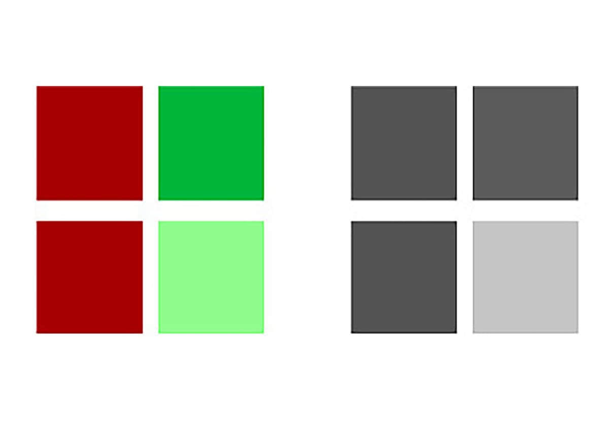
What is the strongest colour contrast?
The 'non-colours' black and white form the strongest contrast, which is the light-dark contrast introduced and named by Itten. The separating effect is also clear in bright colours. A light colour next to a dark colour has a stronger effect than next to an equally light or lighter colour. The highlighting effect of colour tones can be enhanced by strong differences in brightness.


